UK DIY News
Johnstone's Trade reveals the Voice of Colour 2019 Colour of the Year

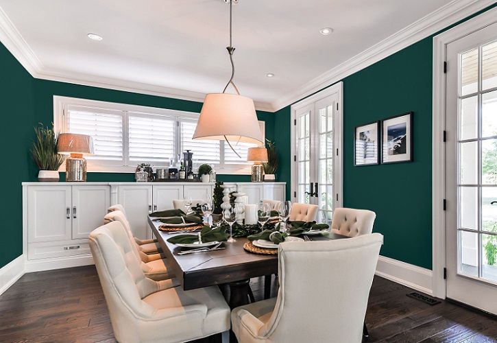
Available exclusively in Johnstone’s Trade in the UK, the highly anticipated Voice of Colour, Colour of the Year for 2019, Night Watch (PPG1145-7) has been announced. A classic and calming shade of deep green, Night Watch evokes lush greenery which emulates the healing power of nature. The luxurious hue is positioned at the forefront of design trends for the year ahead and underpins the impactful 2019 Voice of Colour trends guide.
Defining Colour of the Year
The restorative power of nature, reflected in Night Watch, was a theme that continuously resurfaced during the annual Global Colour Meeting held by PPG (parent company to Johnstone’s Trade) earlier this year. In February, experts from South Asia, North America, Europe and other continents arrived at the Global Colour Forecast Meeting, bringing with them a collective knowledge and passion from which the Voice of Colour forecast was born.
These colour stylists represent many industries, including consumer electronics, architecture, automotive and aerospace. After months of studying consumer behaviours, building materials and décor trends in their respective cultures and markets, the experts were able to share insights that reflect attitudes on a global scale. Over the course of the meeting, the specialists determined which colours best resonate and represent the global colour forecast - including the Colour of the Year.
Donna Taylor, Principle Colour Consultant at Johnstone’s Trade said: “The appeal of Night Watch is how the shade invokes our deep connection to nature, as well as being such a classic, rich and timeless green. A retreat to the natural world is a universal theme, and one we saw recurring during our Global Colour Meeting. The hue is a really versatile shade, suitable for a variety of spaces and design segments – from commercial spaces such as hotels or restaurants to residential design.
“The colour can be incorporated into interior design as a feature wall; it also pairs well with gold or brass accents. It can be especially impactful in places without any outdoor views, such as the end of a hallway with no windows. For exteriors, Night Watch is a gorgeous alternative to the trending black or deep blue, and it works well on doors and shutters too.”
The 2019 trends guide – WE ARE
While Night Watch is the colour selected to spearhead the 2019 trends guide, titled WE ARE, it is just one of 2000 colours in the Voice of Colour palette. The palette provides direction and design inspiration to architects and designers across commercial and residential markets. Colours are brought to life through four individual design stories that make up the WE ARE 2019 trends guide:
With It
This colour collection resonates with individuals who are youthful in spirit: playful, artistic, creative and energetic. The hues reflect the optimistic drive, collective nature and the diversity of today’s young adults. However, it is important to note that this theme is not defined by a certain age, but rather the collective spirit. The palette incorporates vibrant, lively hues like High Note, a cheery red; Burning Gold, a bold yellow; and Water Fight, a playful blue.
With Class
Focused on old-school elegance, this palette offers a rainbow of saturated darks that convey a worldly tone while simultaneously expressing a contemporary aesthetic. Elegant gem tones, like Wave of Mystery and Chilled Wine, feature in this palette. Softer tones like Handful of Dust, a warm brown, and Cinnamon Diamonds, a beautiful red, offer a timeless feel that exudes sophistication and tradition.
With Out
This theme represents the desire for simplicity, a craving for things that make us feel healthy, grounded and calm. The design aesthetic emphasises an interest in minimalism and connectedness to the outdoors. The colour collection boasts an abundance of nature-inspired greens like Midnight Glade and Antique Slate, as well as organic colours like Cocoa Delight and Cool Concrete.
With Spirit
This colour collection addresses the rise of spirituality. It’s for those who seek to infuse their interest in meditation, zen-living, mindfulness and the cosmos into their environment. Intense hues, like the bluish Imperial Purple, evoke spiritual overtones. These pair well with colours like Violet Dream that serve as softer, romantic accents.
In the UK, Voice of Colour is available exclusively through Johnstone’s Trade, bringing the latest colour trends to its customers. Visit www.johnstonestrade.com/colour for more information.
Source : Johnstone's Trade Press Release
Insight DIY always publishes the latest news stories before anyone else and we find it to be an invaluable source of customer and market information.


