UK DIY News
Crown Paints Launches Colour Collection To Help With Customer Specification
Crown Paints has revealed its Colour Insights for 2024/2025 – a carefully curated set of colours, inspired by global trends, that will support decorators in having colour conversations with customers.
Developed by colour and interior design experts, and inspired by trends spanning lifestyle, fashion, and the environment, the collection is comprised of four palettes: Community, Solutions, Pivot, and Escape.
Each palette has been designed to help decorators discuss colour with customers, combining different shades to provide distinct colour schemes that will help inspire customers and aid colour selection.
Justyna Korczynska, Senior Designer at Crown Paints and Colour Insights panellist, said: “At Crown, we understand how powerful and transformative colour can be, and how important it is for decorators to be able to give their customers helpful colour advice.
“We’ve spent countless hours over the past 12 months, drawing from our collective experience as consultants, designers and specialists, to develop this collection, designed to support decorators in their colour conversations.
“We’re so proud of the collection we’re unveiling today and hope it’s another valuable tool, alongside our colour cards and fan decks.”
Crown’s 2024/2025 Colour Insights are:
Community
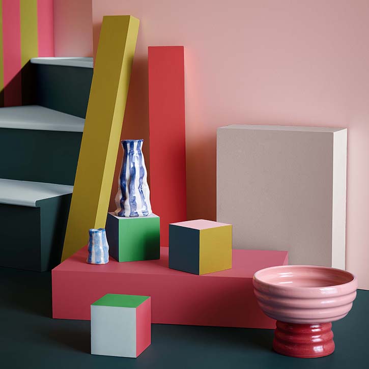
The Community palette is all about using colour to create joyful, invigorating spaces that bring people together.
Inspired by inclusivity, individuality and identity, the collection breathes life and excitement into any space by celebrating brave design choices, such as bold colours, high contrast, and colour blocking.
The palette includes an almost primary red, yellow, and green, as well as hot pink for bold accents. Combined with more gentle pink and blue pastel shades and a soft warm grey to provide balance and contrast.
Solutions
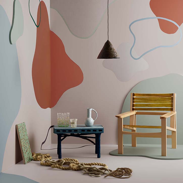
Showcasing how design can learn from the natural world, the Solutions palette embraces nature in all its forms, textures, and imperfections.
The palette – which takes its inspiration from upcycling and the appreciation of the natural world – brings a broad cross section of both bold and soft tones, inspired by the accidental colour palettes often found in recycled materials.
Warm terracotta is paired with desaturated blues, greens and neutrals, alongside small accents of brighter blue and green shades, inspired by sea and river glass.
Pivot
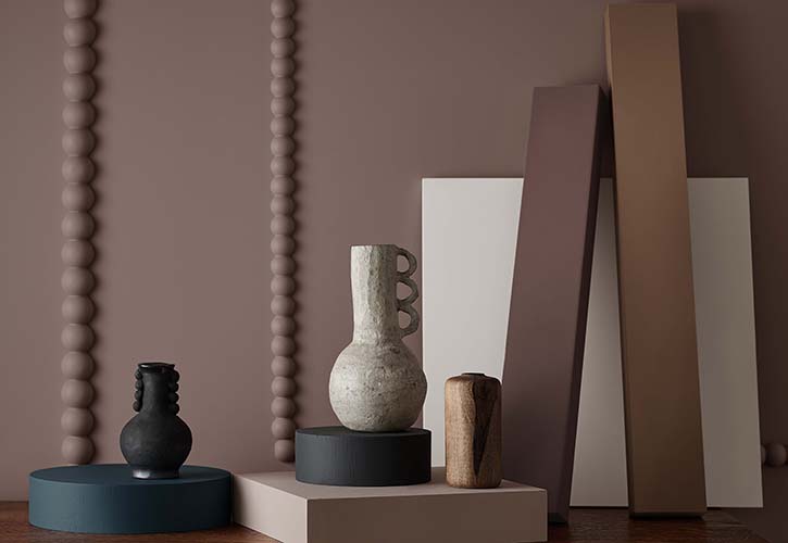
Intended to create a comforting environment, the Pivot collection is rooted in heritage and quality, aiming to act as an antidote to the contemporary fast-paced, high-consumption world.
The focus of this palette is on people, ethics, and harping back to older and better ways.
The well-balanced palette blends calming, earthy tones such as tans and warm neutrals, with blue-greys and perfectly complements hand-crafted, salvaged, and reupholstered home furnishings.
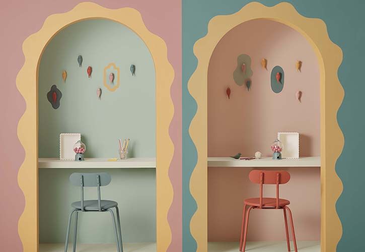
Escape (main image)
Candy colours such as mint green and warm yellow contrast with sugary pink tones in the dream-like Escape palette, evoking a sense of nostalgia and playfulness.
Inspired by colours from old holiday photographs, keepsakes and vintage movie sets, Escape is a pastel-coloured sensory getaway for interiors.
The palette feels retro and quirky, but remains modern by creating a sense of the surreal, encouraging decorators to break away from the mould and let their creativity run free.
For more information, visit: www.crownpaintsprofessional.com
Source : Crown Paints
Thank you for the excellent presentation that you gave at Woodbury Park on Thursday morning. It was very interesting and thought-provoking for our Retail members. The feedback has been excellent.


